From Clicks to Connections: How Blogging Boosts Your Digital Strategy

In our rapidly evolving digital landscape, businesses have countless opportunities to engage and connect with their audiences online. Social media, emails, and paid ads are essential, but one marketing tool continues to stand the test of time: blogging. Blogging for brand awareness is more than a way to share industry insights or updates—it’s a fundamental part of an effective digital marketing strategy. So, why is blogging still relevant, and how does it drive real results?
Boosts Search Engine Visibility
One of the most significant benefits of blogging is that it enhances your website’s visibility in search engine results. Regularly updated blog content with relevant keywords, titles, and meta descriptions helps your website rank higher on Google and other search engines. This means that when potential customers search for topics related to your industry or products, they’re more likely to find your site.
Focusing on strategic keywords and popular topics in your field allows your blog posts to draw in organic traffic over time, making it easier for customers to discover you without paying for ads.
Positions Your Brand as an Industry Expert
When you share insights, how-to guides, and updates through your blog, you’re establishing your brand as a reliable resource. This builds your authority in the industry, positioning you as an expert that customers can trust. Providing valuable content demonstrates that you understand their needs, are up-to-date on trends, and have solutions to common problems.
Over time, this can help cultivate a following, as readers rely on your brand for insights, news, and reliable advice. Whether you’re in retail, tech, hospitality, or healthcare, every industry benefits from a blog that educates and informs.
Give Your Content to Recycle
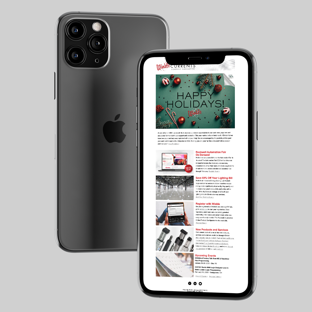
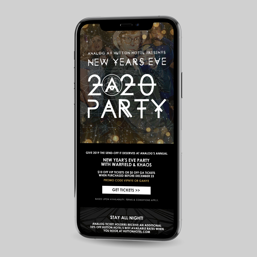
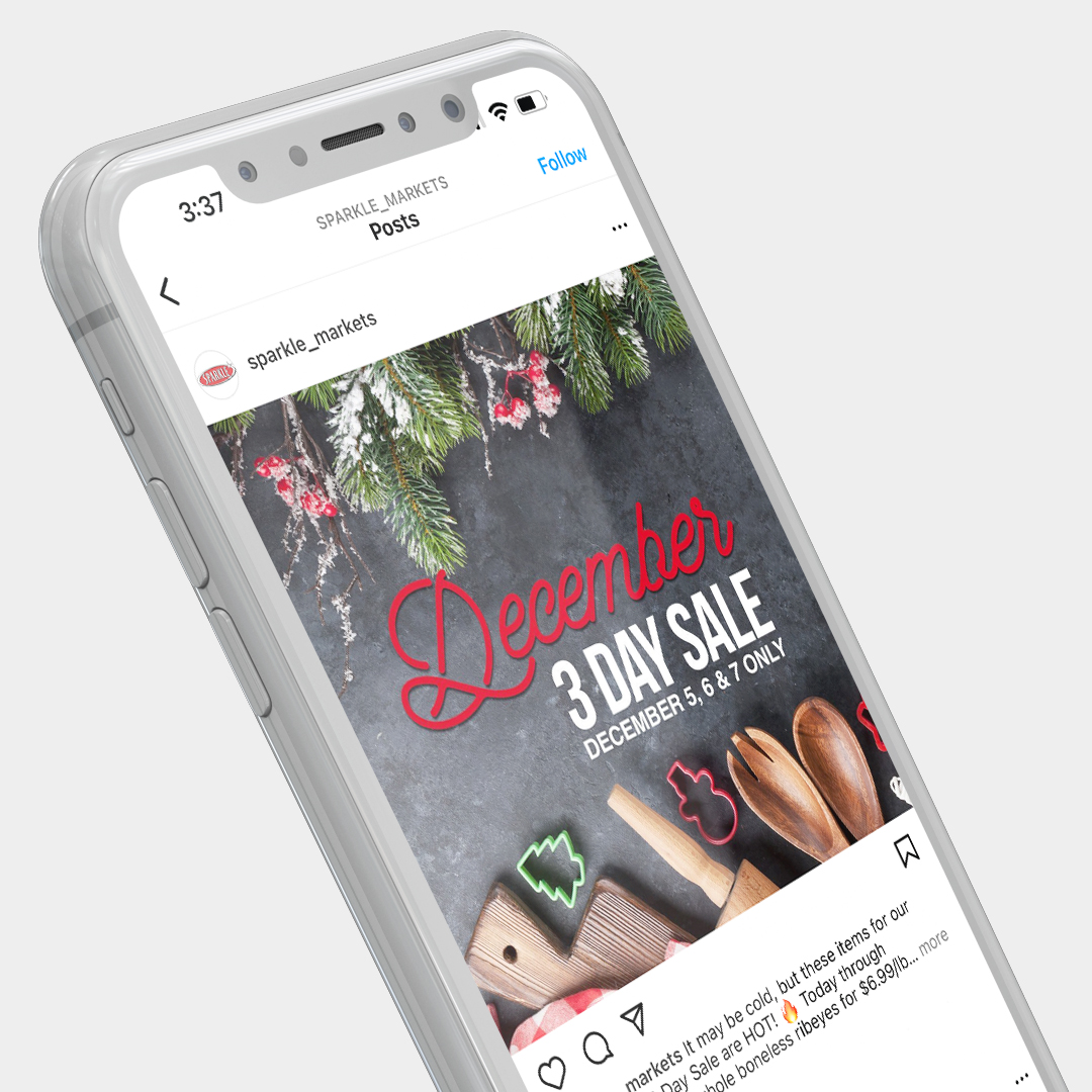
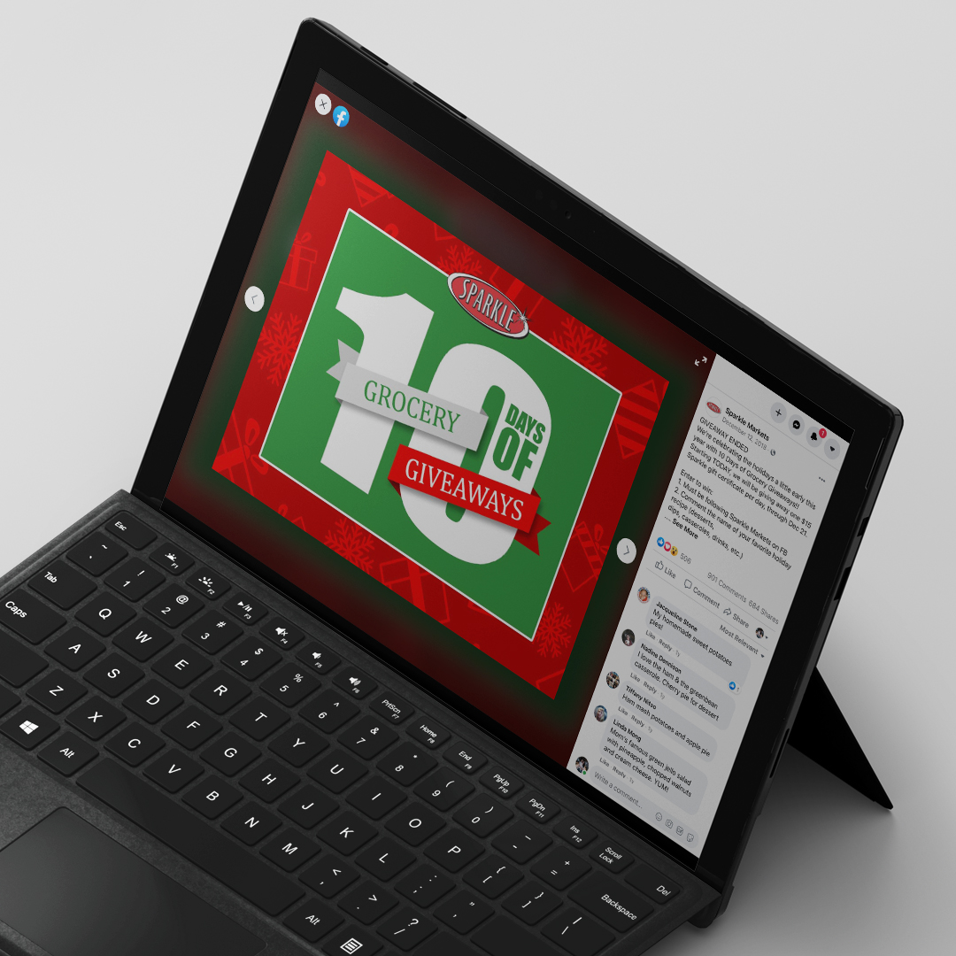
Creating fresh content for social media or email campaigns can be challenging. A blog provides a steady stream of valuable, shareable content for these channels. Each blog post becomes a potential social media post, a discussion topic, or an email update.
Instead of pushing out purely promotional content, you can share blog posts that entertain, educate, or inspire. This adds value to your followers’ feeds and inboxes and increases the chance your content will be shared, helping you expand your audience.
Provides Insights into Your Audience
Blogs offer valuable insights into your audience’s interests. By analyzing which posts are performing well, you can gain an understanding of your readers’ preferences and questions. This can inform your future content strategy, helping you create posts that resonate with your target audience.
In addition, blog performance can provide a solid foundation for your paid ad campaigns or new product development. When you know what topics generate the most interest, you can shape your entire marketing approach to better align with audience preferences.
Offers Long-Tern ROI
Unlike ads that stop working the moment you stop paying for them, blog posts continue to drive traffic, leads, and brand awareness over time. With well-researched content, a blog post can continue to provide value for years, attracting organic visitors and reinforcing your brand presence.
This makes blogging for brand awareness a cost-effective, long-term investment for businesses of all sizes. Plus, as your blog archive grows, it creates a powerful foundation of content that can be used to re-engage existing customers or introduce new ones to your brand.
In a world where content is king, blogging remains one of the most effective ways to build brand awareness, increase engagement, and drive long-term growth. It’s not just about publishing content; it’s about creating a space where your audience can learn, engage, and develop trust in your brand. Whether a small business or an established company, incorporating blogging into your digital marketing strategy is essential for driving meaningful results and setting your brand apart.
Looking for more tips on marketing your business and reaching the right audience? You can find us on Facebook, Instagram, or your inbox. If you’re in search of a more personalized plan, give us a call at 330-286-0487 or send an email to info@mcconnellmarketing.com to see how we can help you grow.