Tag Archive for: Content Marketing

Enter Micro-Interactions: How Small Animations Create High-Converting Websites

While a massive overhaul sets the foundation for a brand, the real magic lies in the details that follow. Micro-interactions are the subtle animations that turn a high-end redesign into a living, breathing experience. By mastering these small moments of feedback, you can elevate a structural transformation into a seamless conversation that builds lasting trust.

Stop Ghosting Your Users

There is nothing more awkward than a digital wimpy handshake. When a user clicks a button and nothing happens, their brain does not think the server is just busy. Instead, it assumes the site is a graveyard, and they are being ignored. Micro-interactions act as the visual confirmation that prevents users from rage-clicking your UI into an early retirement. By giving a button a subtle press or a loader a smooth spin, you provide the instant validation people crave in an era of shrinking attention spans.

The Art of the Invisible Tour Guide

Think of micro-interactions as the silent butler of your website. They are there when you need them, but never shout in your face. Instead of cluttering your layout with desperate arrows like it is a 2005 Geocities page, you can use motion to guide the eye. A gentle wiggle on a notification bell or a sleek hover effect tells the user exactly where to look next without requiring a manual. In 2026, if your design does not move, it is not minimalist. It is just paralyzed.

Digital Dopamine and the Ooh Factor

Every designer has access to the same clean fonts and grid systems. If you want to move from generic templates to a brand people actually remember, you need to weaponize delight. A clever loading animation or a fun icon explosion is not just eye candy; it is personality. It is the difference between a cold ATM transaction and a high five from a friend. These tiny hits of dopamine build a subconscious bond with the user that makes your site feel less like a tool and more like an experience.

Don’t Make It Weird

While we love a good animation, there is a fine line between delightful and nauseating. Nobody wants to wait three seconds for a menu to do a backflip every time they try to navigate. The goal is to be fast and functional. This means the interaction should happen in the blink of an eye, usually under 500ms. If your animation is so long that the user has time to contemplate their life choices, you have failed. Keep it snappy, keep it purposeful, and keep it tasteful.

Great redesigns provide the foundation, but motion provides the heartbeat. If your site feels more like a static brochure than a dynamic experience, it is time for a professional facelift. Contact the web experts at McConnell Marketing to bring your digital presence to life. Still on the fence? Explore our library of design case studies or take a look around our own site to see our favorite micro-interactions in action.

Marketing-Design-Trends-2026

New Year, New Design Trends: What Will Dominate 2026 Mood Boards?

The new year is always a time for reflection and forward-thinking, and here at McConnell Marketing, we’ve been eagerly discussing what the world of design will look like in 2026. Will AI take over, or will human creativity reclaim its crown? We asked our team for their predictions, and the results paint a fascinating picture of the visual landscape ahead. Get ready to update your mood boards!

Here are our top 5 design trend predictions for 2026:

1. The Human Touch: A Return to Imperfection

Deanna’s Prediction: “I’m assuming we will lean into Human-Made trends as designers respond to the influx of instant click designs driven by AI. I assume we will see some hand-cut, grainy, messy designs. At least I hope we do!”

As AI-generated designs become more prevalent and often, more polished and perfect, there’s a strong counter-movement brewing. Designers and consumers alike might crave authenticity and the charming imperfections that only a human hand can create. Expect to see a rise in textures like hand-cut paper, rough edges, deliberate graininess, and a more “collage” aesthetic that celebrates the process of creation. This trend is a defiant nod to human ingenuity in an increasingly digital world.

2. The Comfort of Analog: Nostalgia as Trust

Carson’s Prediction: “I’m thinking we’re going to lean heavily into the return of Analog/nostalgic design. People want something that feels trustworthy, and with the heavily saturated junk we see online, in commercials, etc., it’s hard to trust anything.”

In an era of information overload and digital noise, there’s a deep-seated desire for things that feel real, tangible, and reliable. Analog and nostalgic design elements offer a sense of comfort and familiarity. Think vintage-inspired typography, muted color palettes reminiscent of old photographs, retro illustrations, and design layouts that evoke simpler times. This isn’t just about aesthetics; it’s about building an emotional connection and conveying genuine trustworthiness in a crowded marketplace.

3. The AI Evolution: A Balancing Act

Angie’s Prediction: “I think we’ll see a balance of a fight for these human-made designs, but also a huge influx of AI designs as the technology continues to evolve.”

This prediction acknowledges the dynamic tension in the design world. While there’s a longing for human-made artistry, the undeniable power and accessibility of AI tools cannot be ignored. 2026 will likely see designers both embracing AI for efficiency and exploration, while simultaneously pushing back with uniquely human creations. We’ll witness sophisticated AI tools generating innovative layouts, illustrations, and even entire branding packages, but the most impactful work will likely be a hybrid, where AI assists, but human creativity guides and refines.

4. Sustainable & Eco-Conscious Design

Beyond aesthetics, the ethical and environmental impact of design will continue to grow in importance. 2026 will see a stronger emphasis on sustainable design practices, from the choice of materials in physical branding to the digital footprint of websites. Expect designs that visually communicate eco-friendliness through natural textures, earthy color palettes, organic shapes, and minimalist approaches that reduce visual clutter and promote mindful consumption. Transparency in sourcing and production will also be a key visual element.

Whether it’s luxury hospitality or sustainable retail packaging, the goal is the same: meaningful connection. Our work for The Ritz-Carlton, Maui Kapalua shows how intentional design can turn a simple sustainability requirement into a tangible brand asset that resonates with the modern, eco-conscious consumer.

5. Bold Typography & Experimental Layouts

As digital spaces become increasingly crowded, designers will look for ways to make content stand out immediately. This means a surge in bold, attention-grabbing typography, often taking center stage as a primary visual element. Paired with this, we’ll see more experimental and asymmetrical layouts that break away from traditional grids. This trend is about creating dynamic, engaging experiences that captivate users and guide their eyes through information in fresh and unexpected ways.

What are your thoughts on these predictions? Will 2026 bring a tidal wave of AI-driven work, or will we reclaim our creativity with hand-crafted charm? We’d love to hear your insights!

Contact McConnell Marketing Today to Discuss Your Design Needs for 2026 and Beyond!

Pantone Color of the Year 2026

Pantone’s 2026 Color of the Year: Cloud Dancer Has the Internet… Confused? Delighted? Mildly Disturbed?

Pantone Color of the Year 2026

Every year, brands, designers, and trend forecasters anxiously await for Pantone’s Color of the Year announcement. It’s the moment that sets the tone for everything from fashion to packaging to home interiors. But this year, Pantone made a bold move, one that has both designers and the entire internet spiraling into a uniquely 2026 brand of chaos.

The Color of the Year is Cloud Dancer.

And Cloud Dancer… isn’t really a color. It’s an off-white. A slightly warm, barely-there, whisper-of-a-shade that has quickly become the main character of this week’s memes. Think: the color of boiled chicken. The glow of a refrigerator light at 2 a.m. The exact shade of “we ran out of paint halfway through.” Or, as the internet has lovingly dubbed it, “Hellmann’s Chic.”

Yet behind the mayonnaise-level mayhem, there’s something undeniably interesting about Pantone leading with a near-non-color. In a digital world full of bright neons, maximalist palettes, and AI-generated visuals screaming for attention, Cloud Dancer offers… a pause. A palette cleanser. A chance for brands to rethink how minimalism, breathing room, and simplicity can communicate a message.

What Cloud Dancer Means for Brands & Design in 2026

While the memes have their moment (and we fully support the creativity, especially the now-iconic comparison to a boiled chicken breast), Cloud Dancer does have strategic potential:

  • It pairs with everything. As far as neutrals go, this one plays well with bold typography, saturated accents, and highly visual product photography.
  • It leans into warmth. Unlike stark whites, this shade has a softness that can make tech, hospitality, and lifestyle brands feel more approachable, something we at McConnell Marketing are leaning into with a few website designs, specifically, we’re working on at the moment (stay tuned for the reveals!).
  • It signals a shift. Trend cycles are swinging away from clutter and sensory overload. Cloud Dancer reflects a desire for calm, clarity, and intentional design.

A Win for Minimalists Everywhere (and for Your Eyes)

For those of us in marketing, Cloud Dancer is a reminder: sometimes the simplest solutions have the most impact. In a world of endless scrolling and visual overstimulation, an off-white may be exactly what stands out.

Even if it did get roasted online for looking like:

  • hospital hallway paint,
  • the inside of a marshmallow,
  • or the default PowerPoint background that everyone forgot to change.

How McConnell Marketing Sees It

We’re taking Cloud Dancer as a blank canvas, literally. It’s a chance to reimagine brand palettes, explore subtlety, and embrace design choices that give content (and consumers) room to breathe. Whether you love the color or are still laughing at the seemingly endless memes, one thing’s for sure:

Pantone got everyone talking.

And in the world of marketing? That’s the brightest, boldest color there is.

Ready to Bring Cloud Dancer Into Your Brand?

Whether you’re leaning into Pantone’s minimalist moment or simply want to refresh your visual identity for the upcoming year, our team at McConnell Marketing can help you make Cloud Dancer (or any color) work beautifully for your brand. Reach out today and let’s create something striking.

Our New Website Proves It: Relax, We’ve Got Your Marketing Covered

Our New Website Proves It: Relax, We’ve Got Your Marketing Covered

We are thrilled to announce that the digital doors to our new McConnell Marketing website are officially open; we’re so glad you’re here! This isn’t just a fresh coat of paint; it’s a complete digital overhaul designed to better serve you: our clients and future partners.

The entire new experience is built around one simple promise: “Relax, we’ve got you.”

Focused Expertise for Your Industry

Our primary goal with this redesign was to make it effortless for you to find the exact help you need. The new site is now clearly structured around our three main focus areas where we deliver the most impact:

  1. Hospitality Marketing: Elegant, brand-forward hotel marketing tailored for your property.
  2. Tourism Marketing: Flexible expertise in attracting visitors for destinations, bureaus, and attractions.
  3. General Marketing & Design: Comprehensive services, from website development and graphic design to content and SEO, tailored for small-to-large businesses across all sectors.

A Modern Vibe, Built In-House

If you’ve spent any time on our new site (we hope you have!), you’ll notice a distinct shift in our brand aesthetic. We’ve subtly refined our signature color palette, transitioning from the vibrant McConnell lime green, which has been a staple for roughly 30 years, to a calmer, more subtle mint green, complemented by elegant accents of beige, grey, and white.

The sleek, modern design is supported by advanced functionality, featuring custom coding, unique animations, and an architecture built for speed and discovery. Beyond the design, we built the new site with enhanced SEO baked into every page, ensuring it ranks high and performs flawlessly.

And here’s something we’re especially proud of: This entire site was designed and built 100% in-house by the McConnell Marketing team.

From Carson, Firm Partner: “Our new website represents who we are today: focused, modern, and driven by great design. The entire process, from mockups to final coding, was handled by our talented team, highlighting the high-level digital expertise we bring to all of our clients’ projects.”

Design is Our Engine

Our in-house capabilities allow us to control every detail of the user experience and ensure the final product is both beautiful and highly effective.

From Deanna, Firm Partner: “Design isn’t just a service we offer, it’s what fuels us. With three full-time, passionate designers on our team, we live and breathe the creative process. This new website is a testament to the idea that thoughtful, strategic design is the foundation for every great marketing campaign.”

Another thing to note is that this sleek, modern design is supported by advanced functionality, featuring custom coding and unique animations.

From Angie, Account Manager & Senior Designer: “We approached the build with an absolute focus on user experience. The navigation bar, for instance, is the first thing a visitor sees, so we designed it to be intuitive, clean, and unique. The videos and custom animations shown throughout the site demonstrate our technical skill and reinforce the message that we are an approachable team you can trust to handle your most important digital assets.”

When you choose McConnell Marketing, you’re not just getting an agency; you’re partnering with a team that has the digital design and development chops to build high-performance assets from the ground up.

Ready for Your Own Digital Refresh?

Whether you’re struggling with outdated design, poor user experience, or low search rankings, your website is your most critical marketing asset.

To help you get started, we’ve created a free practical guide to freshen up your website and move it confidently into the modern web. If those ideas spark a larger vision for your project, we’d love to chat. Contact us today to schedule a discovery meeting. Let us handle the heavy lifting and put our expertise to work for your business!

Mandarin Oriental named World’s Best Luxury Hotel Brand in 2025 by Luxury Travel Intelligence

Since opening its first property in Hong Kong in 1963, Mandarin Oriental has built a reputation for being one of the most detail-oriented hotel brands in the world. Its portfolio now spans 40 hotels and residences in 26 countries, all of which highlight the same, unwavering commitment to the guest experience.

This attention to detail isn’t just an aesthetic refinement. It is a philosophy that is at the heart of every guest touchpoint. How the staff anticipates needs, how the space is designed, and how the brand’s identity remains consistent from one location to another. It is what fuels the loyalty of guests, who know they can expect the same meticulous level of hospitality whether they are staying in New York City, London, or Milan.

Mandarin Oriental New York

One of Mandarin Oriental’s flagship properties is located in New York City. In a destination where hospitality competition is at its peak, the smallest part of the guest experience is all a part of a bigger picture. We’ve had the privilege of working with this property directly, supporting their marketing efforts for over 14 years by producing a myriad of projects from custom sell sheets and brochures to high-end restaurant menus and holiday e-cards.

At first glance, printing business cards may seem like a small task, but with Mandarin Oriental, nothing is small. Their branding guidelines are meticulous, with very precise rules around typography, spacing, paper finish, and color tones. Every business card is more than just contact information. It is a solidification of their commitment to the brand’s luxury standard.

Every project gives us an inside look at how deeply Mandarin Oriental protects (and elevates) its identity. Even in the details that are often overlooked, their commitment to excellence shines through and makes their guest’ experience memorable.

Behind the Scenes of Excellence

For people curious about what drives this level of card, Mandarin Oriental recently offered a look into the process with their documentary Inside the Dream. The film highlights their guest-centered brand philosophy, showcasing the planning behind every interaction. Viewers see how they don’t just provide service, they cultivate a bespoke experience rooted in anticipation, empathy, and precision.

It’s a rare opportunity to witness the inner workings of a brand that redefines hospitality and proves why Mandarin Oriental deserves to top lists like LTI’s.

The Details Matter

For luxury brands, details are everything. They signal to guests that nothing in their stay has been left to chance. It is all meticulously curated and considered. From the weight of the stationery in rooms to the cadence of the staff’s greeting, Mandarin Oriental has mastered the art.

Our work with their New York City property brought that philosophy to life in a very tangible way. It was a reminder that every size detail tells a larger story of excellence.

That’s why the brand continues to earn recognition and wow guests and institutions like LTI. Their success isn’t solely about upscale amenities: it’s about creating a foundation of trust and consistency in world-class hospitality.

Need some more ideas on how to make your property stick out from the rest? Email us at info@mcconnellmarketing.com to get started.

Why Do Some Hotels Smell So Good?

comfortable hotel room

Ever walked into a hotel lobby and thought Wow, it smells amazing in here? Or sank into the most crisp, perfectly soft sheets and wondered how they were so comfortable? You’re not imagining it. Hotels use psychology, scent branding, and thought-provoking design to create experiences that guests love and want to repeat.

The Power of Smell: Scent Branding 101

Scent is one of the most powerful senses when it comes to memory and emotion. Many hotels invest in signature fragrances for their diffusers, candles, and even detergents to make their spaces instantly recognizable and appealing to guests. The right scent can:

  • Create a sense of calm and relaxation
  • Trigger positive memories
  • Increase guest loyalty by making the experience memorable

Some luxury hotels even use subtle scents in hallways or elevators, so guests associate the entire property with a specific mood or feeling.

Sheets & Sleep: The Science in Comfort

It’s not just smell! Touch matters, too. Hotels know that the tactile experience of a room can make or break a stay. High-thread-count sheets, carefully laundered towels, and mattresses designed for long-term comfort all contribute to the overall experience. A few things that make hotel sheets feel so special include:

  • High-quality cotton or linen blends
  • Precise laundering techniques (softeners, starches, pressing)
  • Crisp folding and presentations that signal cleanliness and care

When a guest sleeps well, they’re more likely to leave positive reviews, return, or recommend the hotel to friends.

Beyond Scent & Sheets: Multi-Sensory Design

Hotels increasingly consider the full sensory experience:

  • Sound: Soft background music or calming ambient sounds
  • Sight: Clean, thoughtfully arranged rooms with cohesive color schemes
  • Touch & Smell: Luxurious linens, soothing lotions, subtle scents

Together, these elements craft an environment that feels not only comfortable, but curated. They all work together to create a place where guests want to linger and return.

What Hotels Teach Us About Experience Design

The lessons from hotel experiences can apply anywhere! Whether you’re running a small boutique hotel or just designing your home guest room, attention to scent, texture, and overall ambiance creates lasting impressions. The goal is simple: make people feel cared for, relaxed, and delighted even in the small and subtle ways.

Need some more ideas on how to make your property stick out from the rest? Email us at info@mcconnellmarketing.com to get started.

copywriting mistakes

 7 Common Copywriting Mistakes on Your Website

CopyWritingMistakes

Your website is often the first impression a potential client gets of your brand–and that impression can either convert or repel a person. Clunky copy, vague headlines, or keyword stuffing might not seem like dealbreakers, but they could be quietly driving people (and search engines) away.

Let’s talk about common copywriting mistakes websites make that can hurt both user experience and SEO, and how you can fix them for good.

Too Much Fluff, Not Enough Clarity

You might be tempted to sound clever or poetic, but if copywriting mistakes like vague messaging can make people click away before they even know what you offer. Explain who you are, what you do, and why it all matters in a clear, digestible way.

Fix It: Lead with clarity. Use straightforward headlines, meaningful subheadings, and concise body copy. “We help hotels increase direct bookings through smart design and meaningful marketing,” not “A new era of hotel marketing awaits.” What does that even mean?

Keyword Stuffing or Ignoring SEO

Keywords definitely matter in the world of websites, but overloading with repetitive phrases will make it unreadable for humans and a red flag for search engines. This is one of the more technical copywriting mistakes, but it’s a big one you should be aware of.

Fix It: Focus on one or two key phrases per page and use them naturally a few times on the page. Optimize meta descriptions, headings, and alt tags with keywords without sounding robotic.

No Clear Call-to-Action

If users reach the end of your homepage and don’t know what to do next… you’ve lost them. Even if you’re just on a page talking about your brand’s story, the next “now what?” should be an obvious answer.

Fix It: Every page should have a clear, relevant CTA that leads them to the next step. Try and include a point of contact or an internal link on each page.

Too Much Jargon or Industry Speak

You know your business inside and out, but your dream client might not. Overusing acronyms or technical terms can leave site visitors confused and out of the loop, deterring them from sticking around. This copywriting mistake creates a barrier instead of a bridge.

Fix It: Write industry-specific content like you’re talking to your grandma. Use simple, friendly language that helps build trust.

Inconsistent Tone or Brand Voice

Unless your audience expects it, writing like a law textbook will turn readers away. Tone should match your brand! But it also needs to feel natural and in-character. It’s a delicate balance.

Fix It: Read your copy out loud. If it doesn’t sound like how your customers talk, it probably needs to be revised.

Walls of Text With No Flow

No one wants to read a novel on your homepage. Dense blocks of copy are overwhelming and tend to get skipped. Might be a tough pill to swallow, but no one cares about your brand as much as you do.

Fix It: Get the point across with short paragraphs, headers, bullet points, and white space. Make your content skimmable and easy to take in.

Forgetting Mobile Users

This one may be more than a copywriting mistake. But is there anything more annoying than trying to load a website on your phone’s browser and the text is tiny, buttons are impossible to tap, and you’re scrolling back and forth to read a single sentence? Don’t be that website– unless you want to say goodbye to 62% of potential customers.

Fix It: Review and optimize your site for mobile formatting and make sure your CTA’s are tap-friendly.

The Takeaway

Your website copy could be tricky to nail down. You want to appease the search engines while also connecting with the people who keep your business running. There’s no perfect way to do it, but there is a wrong way. If you need help getting your copy right, we’re here to help. Contact us to get started!

Nostalgic Marketing: How the Past is Driving the Present

vintage orange tv on counter With the speed of social media and connectivity provided by the internet, trends tend to fade in and out overnight, and technology is constantly changing. One timeless emotion is driving some of the most powerful marketing campaigns: nostalgia. From 90s inspired campaigns to a resurgence of retro products, nostalgic marketing is more than a passing trend. It’s a clever way to connect with consumers across generations.

Why Nostalgic Marketing Works

Nostalgia marketing taps into positive memories and emotions associated with the past. Studies show that nostalgia makes people feel safe, comforted, and connected. A powerful trio when it comes to influencing decisions. In uncertain times, brands that evoke “simpler times” often see greater engagement, loyalty, and emotional connection. The turn towards nostalgic marketing has been harnessed by brands in a few different ways. Some have rereleased products from the era. For example, Nike and Puma have both revived retro sneaker designs within the last year, while some products have been completely conceptualized with inspiration from the past. The rise in popularity of “dumbphones” has proven that people long for a simpler time when a phone was a phone–not a map, music player, camera, and anything else you can fit on it.

How You Can Join

First, know your target audience. Gen X-ers may not respond to Y2K trends the way Millennials do. Boomers? Bring up some 60s and 70s memories.

lineup of vintage-inspired designed Vacation Sunscreen Products

Vacation Sunscreen Products

  Blend the old with the new in your approach. Think vintage style but with modern relevance. (Remember those classic retro editorial ads with limited imagery and clever copy?)

'80s New Balance Editorial Ad

New Balance Editorial Ad

Let nostalgia tell your brand’s story. Instead of just using an old logo, frame it around a shared memory. Macaulay Culkin’s return in a smart home parody of Home Alone brilliantly merged childhood memories with modern tech, striking the perfect nostalgic chord.


Google Assistant’s Home Alone Ad

Stay authentic with your efforts and show that you understand and respect the reference material. People are protective of their childhood memories, so tread carefully. How did they reboot a cult classic like Mean Girls and never mention in the trailer that it was a musical? Audiences noticed. The YouTube comments were quick to call it out, and the marketing team caught backlash for misleading fans.


Mean Girls (2024) Trailer

The Takeaway

In a crowded market, emotional connection is the key to standing out, and few emotions are as powerful as nostalgia. When used thoughtfully, it can transport audiences, build trust, and create lifelong brand loyalty. The future of your marketing might just lie in the past. Need help with your marketing efforts? Contact us to see how we can help you connect with your audience.

The Marketing Shift Away from Social Media: Why Brands Are Focusing on Owned Channels

Arial view of heavy traffic coming to a 4 way intersection at night. 
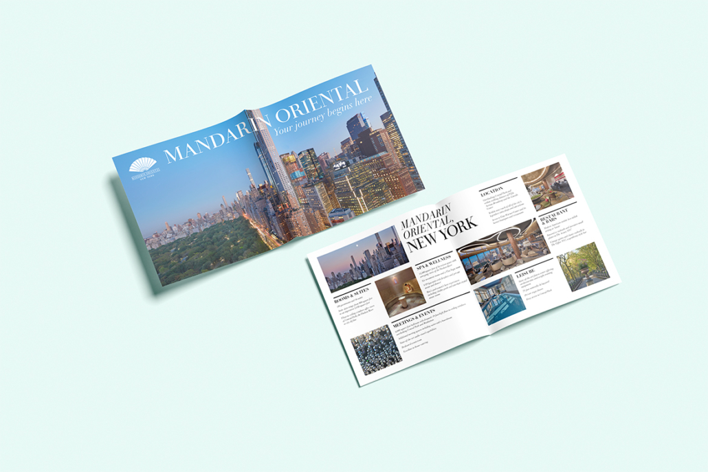
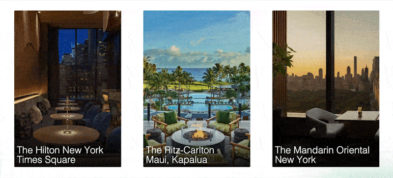
The marketing shift away from social media is no longer a trend—it’s a strategic move. As brands struggle with declining reach, rising ad costs, and unreliable algorithms, more businesses are turning to owned marketing channels like email newsletters, websites, and loyalty programs. These platforms offer greater control, stronger customer relationships, and better long-term ROI. Here’s why the industry is rethinking its dependence on social and investing in marketing strategies they actually own.

The Welcome Email

Social media platforms have been incredibly effective in helping brands grow. But cracks in the foundation are showing, and marketers are paying attention.

  • Algo Dependency – The dreaded algorithm. The bane of social media, and also the reason we have 19-year-old content creators making more than surgeons and lawyers. Organic reach has declined across platforms, and a post might only reach a fraction of your followers unless you pay to promote it. Brands are tired of being at the mercy of ever-changing algorithms.
  • Platform Volatility – From sudden outages to complete shutdowns (RIP Vine), putting all your content eggs in one basket is risky. Plus, policy changes can impact what you say and how you say it.
  • Rising Costs & Declining Returns – Advertising on social media is getting more expensive, all while the results are becoming harder to track and count on. For small businesses, especially, this makes it hard to justify the spend.
  • Data Ownership Concerns – You don’t truly own your audience on social media. If a platform decides to ban your account, shadow ban your content, or change its rules, your entire customer base could vanish overnight.


The Rise of Owned Marketing Channels

The shift away from social platforms and toward owned channels gives brands access to their audience, more control, and better long-term value. Here’s why marketers are reinvesting in them.
  • You Own the DataWith email lists and loyalty programs, you collect first-party data that’s more reliable and actionable than the insights social platforms provide. This becomes critical as cookies are phased out and privacy regulations tighten.
  • Higher Engagement RatesEmail newsletters outperform social media in both open and click-through rates. Subscribers have opted in–they want to hear you.
  • Better Personalization – Owned channels allow for hyper-personalized messaging based on user behavior, purchase history, preferences, and location–something social media can’t do as effectively.
  • Long-Term Relationship BuildingLoyalty programs and email nurture sequences help brands stay top-of-mind and reward repeat engagement. That kind of ongoing value is harder to achieve through fleeting social interactions.
  • Content LongevityContent on websites and in newsletters lives longer than a 240-hour Instagram Story. It can be repurposed, re-indexed by search engines, and discovered by new customers over time.

Where to Invest Instead of Social

If you’re looking to shift away from social media, here are the best channels to build out:
  • Email Marketing – Still one of the highest ROI channels, especially when segmented and automated.
  • Newsletters – Great for consistent engagement and value-driven content.
  • Branded Website or Blog – Your central hub for SEO-rich content, lead generation, and e-commerce.
  • Loyalty Programs – Rewarding repeat customers fosters deeper brand affinity and increases lifetime value.
  • SMS Marketing – Permission-based and highly direct, SMS is gaining traction in retail, hospitality, and service industries.
Fostering the client relationship with a guided journey and these email automation examples is a great place to start or refresh your email efforts! Need some further assistance? We help brands turn their email lists into real revenue–without sounding robotic or salesy (or annoying). So whether you’re just starting or need help optimizing, we can build email automations that convert. Let’s chat! Call us at 330-286-0487 or email us at info@mcconnellmarketing.com to get in touch!

5 Email Automation Examples Every Business Can Steal (And Actually Benefit From)

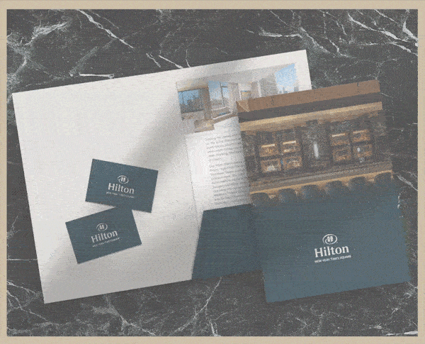
If you’ve ever signed up for a promo, booked a service, or abandoned a cart online, chances are you’ve experienced email automation in action. The goal is to get you to come back and keep that brand at the forefront of your mind. And while it may seem advanced or time-consuming or even expensive, the good news is, it’s none of those things. Email automations are a game-changer for businesses of all sizes and help drive more direct sales, build stronger relationships, and stay on top of mind without lifting a finger. Here are 5 email automation examples that you can steal, tweak, and start using today.

The Welcome Email

The Goal: Make a good first impression. When to Send: Automatically sent when a person signs up for something, books a service, or downloads a freebie. Why It Works: It sets expectations, introduces your brand voice, and gives new contacts a reason to stick around. Try This:
  • Share your origin story or mission in a way that builds trust and humanizes your brand
  • Offer a first-time discount
  • Link to a helpful blog or FAQ

Example: Hey! We’re [BRAND] and we’re so happy to have you here! Whether you’re looking for new email marketing, social media support, or a whole rebrand, we’re here to help. Want to schedule a free consultation call?

The Abandoned Booking or Inquiry Follow-Up

The Goal: Don’t let almost-clients/customers slip away. When to Send: When you have an initial inquiry or interest, but they don’t actually complete the full customer journey. Why It Works: Acts as a nudge when someone may be feeling hesitant to complete a booking or purchase a good. Try This:
  • Keep it friendly and low-pressure
  • Include a link to complete the process or re-engage
  • Add social proof like a customer testimonial

Example: Still thinking it over? We’d love to help you choose the right package. Spots fill fast, so now’s a great time to lock yours in!

The Post-Service Thank You & Review Request

The Goal: Turn happy customers into marketing. When to Send: After a customer has completed their journey with you. Why It Works: It shows appreciation for their input and gives them the perfect timing for a positive review. Try This:
  • Include a personal thank you
  • Link directly to a place to review
  • Offer a referral bonus or discount for sharing/reviewing

Example: Thanks for choosing us, [NAME]! Your feedback helps us improve our services. Leave a quick review and get X% off your next purchase.

The Seasonal or Loyalty Promo

The Goal: Send timely offers without blasting your entire list. When to Send: On certain dates such as birthdays, anniversaries, or holidays, or based on customer activity. Why It Works: It feels more personal and relevant. Try This:
  • Reward repeat clients with a special offer
  • Send seasonal packages that match your service (spring cleaning, holiday deals, birthday gifts, etc.)
  • Automated birthday greetings with a special code

Example: Happy Birthday, [NAME]! Here’s 20% off any service this month. You deserve it!

The Re-Engagement Campaign

The Goal: Wake up the cold side of your list. When to Send: When/if some of your list hasn’t opened or clicked in a while. Why It Works: It filters out cold contacts (which boosts your open rate and decreases your bounce rate) but not before giving you a second chance to win them over. Try This:
  • Acknowledge the silence with a playful tone
  • Highlight what’s new or what they missed
  • Offer an incentive to come back

Example: It’s been a while, huh? We’ve missed you, so here’s 15% off if you’re ready to give us another chance!

Fostering the client relationship with a guided journey and these email automation examples is a great place to start or refresh your email efforts! Need some further assistance? We help brands turn their email lists into real revenue–without sounding robotic or salesy (or annoying). So whether you’re just starting or need help optimizing, we can build email automations that convert. Let’s chat! Call us at 330-286-0487 or email us at info@mcconnellmarketing.com to get in touch!