As marketers, we definitely appreciate a great logo. Logos are one of the most frequent ways through which brands interact with their audience. A well executed logo can improve a brand’s recognition, appeal and even help it stand out from competitors.
In the hospitality industry logos need to convey the atmosphere of the property to guests. A hotel’s logo needs to communicate what the brand is all about but it also needs to be visually appealing and unique.
Accomplishing those goals aren’t easy, and there are plenty of mediocre hotel logos out there, but here is a list of hotel logos that get it right!

The abstract combination of C and S makes for a highly unique design. The choice of font and use of varying weight in the text evokes a contemporary feel for City Suites in this logo.

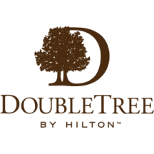
A few years ago Double Tree updated their logo to a more detailed boutique-style design. This version conveys a sense of class that the old logo did not.
Element is a hotel brand built around a core value of sustainability. Obviously the use of green in their logo is going to promote the idea of eco-friendly, but even more powerful than the choice of color is the simple, clean style that this logo uses. The abstract, yet very limited logo and modern font just feels good for the environment.
The Ritz’s classic emblem sets the standard for luxury hotels. The use of a crown and lion conveys feelings of exclusiveness and royalty-level treatment that it’s guests are seeking.
The Georgian Hotel uses simplicity to create a memorable logo. The use of shapes to form a vague outline of buildings as well as the curved lines that surround the hotel name gives this logo a lot of appeal.
Though it may not be the most original logo on the list, something about the Marriot’s logo just works.
The St. Regis is positioned in the same luxury category that the Ritz Carlton is and they also do a great job of getting the exclusiveness point across. Their crest-style logo actually looks like it could be used as the emblem for a high-end country club.
We couldn’t cover all of the great hotel logos in this post. What’s your favorite? Let us know in the comments section below!


