Designing the Next Chapter: Angela McQuistion Joins the Firm’s Leadership Team
There’s a unique kind of pride that comes with building a career in the place you call home. For us at McConnell Marketing, that local story just got a lot stronger.
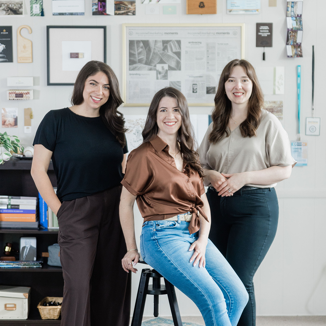
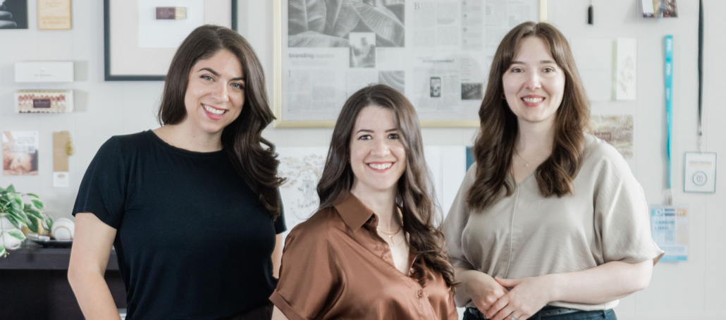
We are absolutely thrilled to announce that Angela McQuistion has officially stepped into the role of Partner, joining Carson Lisko and Deanna Clement to lead our agency into its next chapter.
This milestone represents a major strengthening of the creative expertise we bring to the Mahoning Valley, marking a true full-circle moment for our team.
The Power of a Shared Foundation
If you look closely at our new leadership trio, you’ll find a powerful common denominator: Youngstown State University. All three partners—Angie, Carson, and Deanna—are proud YSU alumni, each holding a degree in Graphic and Interactive Design. This shared creative foundation means we don’t have to waste time getting on the same page. We’re already there. This deep-rooted alignment allows us to collaborate seamlessly and, ultimately, dream bigger for our clients.
As Deanna puts it:
“When Carson and I bought the firm in 2023, our goal was to build a team that truly represented the talent we have here in the Valley. Bringing Angie on as a partner just made sense.”
Enterprise Expertise Meets Hometown Passion
For Angie, a Columbiana native, becoming a partner is the culmination of 13 years spent honing her craft right here in the Valley. Her journey originally started at YSU’s Graphic Services as a student designer, and she has since come full circle, returning to her alma mater as a part-time professor to mentor the next generation of local design talent.
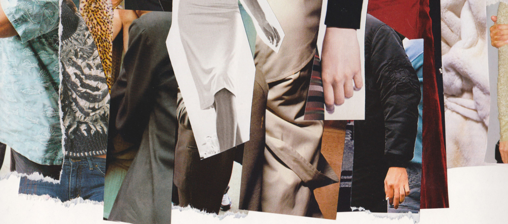
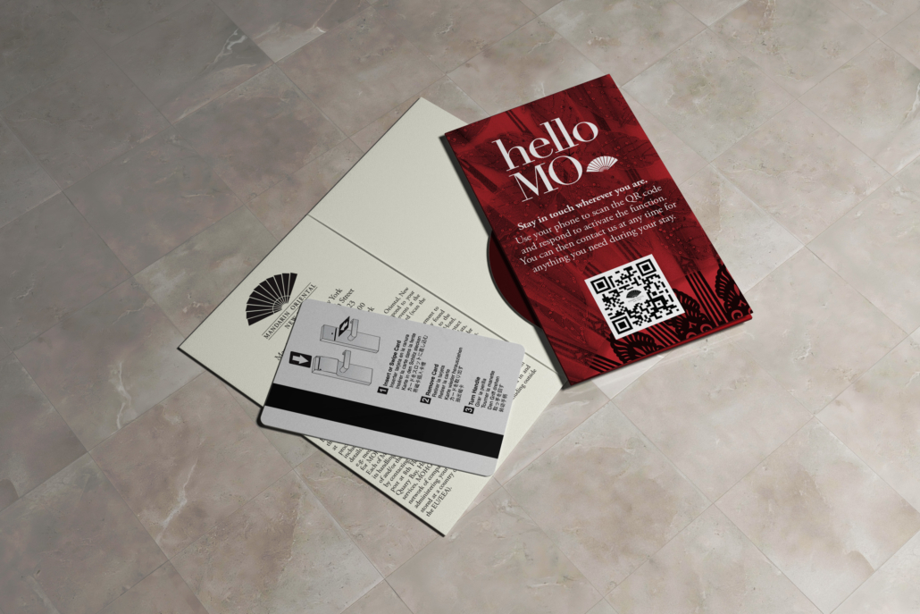
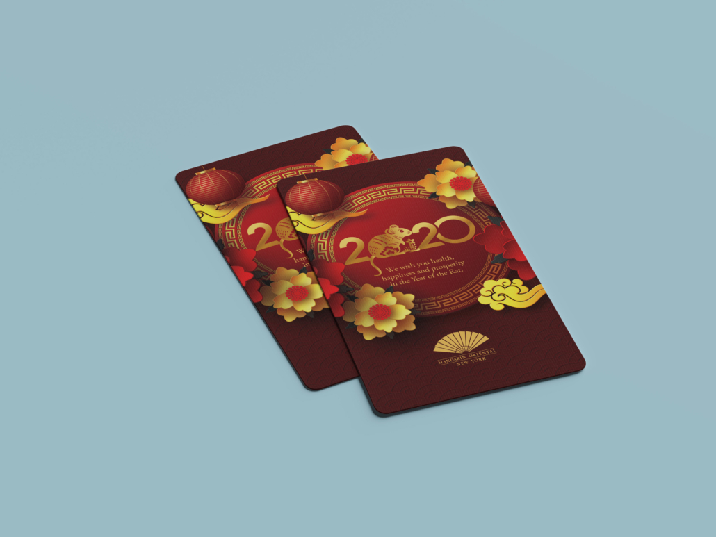
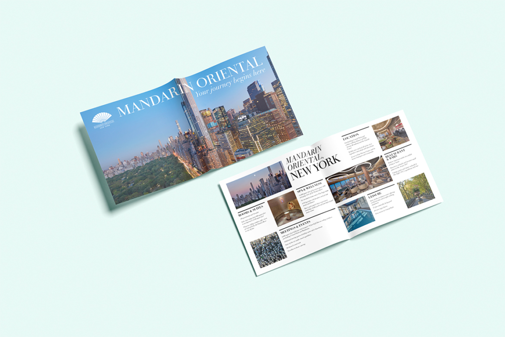
Over more than a decade in the region, Angie has quietly shaped the visual landscape of our community. Her diverse background spans directing comprehensive design and branding strategies for key local sectors—including entertainment and gaming, higher education marketing, manufacturing, finance, healthcare, and major nonprofits. She brings that massive wealth of enterprise-level expertise directly into her new role as Partner, combining a high-level corporate design background with a deep love for the local community.
“I’m just plain happy to help our clients,” Angie says. “This community inspires me, and I want nothing more than to see our local businesses, hospitality, tourism, and nonprofit sectors grow stronger. We have such a great story to tell in this corner of the world, and I love that I get to tell it through thoughtful and impactful design.”
Our “Secret Sauce”
In the agency world, it’s rare to see a leadership team comprised entirely of active creatives. Usually, agencies are managed strictly by business executives. At McConnell, we do things differently.
“Having three partners who are all designers by trade is our secret sauce,” Carson explains. “We don’t just manage the business; we are heavily involved in the work. Our agency is proof that you don’t have to leave the Mahoning Valley to find top-tier strategy and design.”
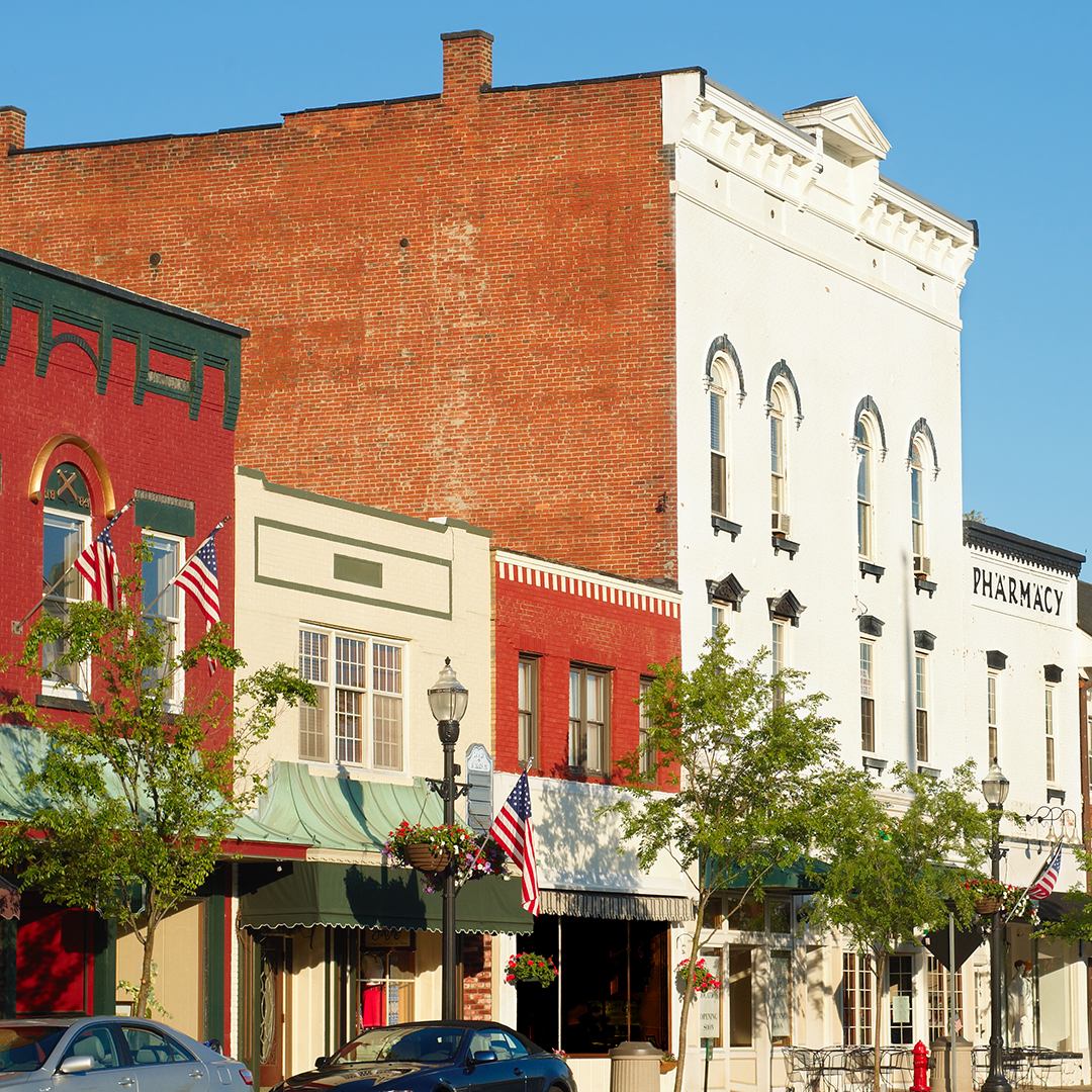
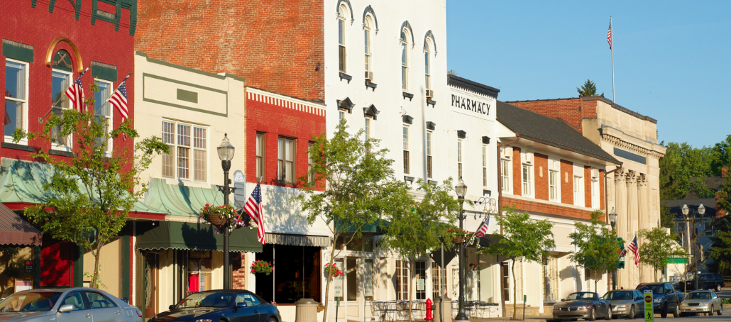
As proud residents of the Tri-County area and active members of the Regional Chamber, our focus remains exactly where it has been since Mark McConnell founded this agency in 1991: meeting people where they are. We are dedicated to ensuring that local businesses have access to world-class, enterprise-level strategy without ever losing that welcoming, neighborhood feel.
Looking Forward
Whether we are crafting large-scale regional tourism campaigns or building intentional, high-impact visual identities for local small businesses and nonprofits, we are here to help this community thrive.
With Angie officially on board as Partner, we’ve never been more excited to design what comes next.
Want to collaborate with our leadership team on your next branding, web design, or digital strategy project? Get in touch with us today—let’s build something great right here at home.