The Secrets of Long-Standing Brands


How is it that some brands have stood the test of time despite a market where visual trends change by the minute, technology is always advancing and culture is constantly shifting? Brands have two options: they can either ignore these obstacles and become irrelevant, or they can adapt and remain a strong presence in their respective markets.


There are three things that all long-standing brands have in common: they are consistent, true to themselves and they adapt when necessary. A brand achieves consistency when they remain aligned with their values and mission over time. This is executed through actions and can also be communicated visually. Let’s take a look at a few brands that have successfully achieved consistency in their lifetime:

Tiffany & Co.

Tiffany & Co. is a great example of a brand that has remained persistent over their lifespan. Tiffany has been around since 1847, and in their 175 years, their logo has remained the same.


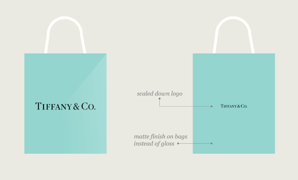
This isn’t something that would work for every company, but in the case of Tiffany, it only strengthens their brand. They have a clear vision to be the arbiters of taste and style. Every choice they make must fall in line with that vision. The longer they exist in the world of luxury, the more desirable they become and they have a strong understanding of this. Tiffany is most famous for their signature Tiffany Blue, which has been an unwavering element in their branding. Even Tiffany must still make an effort to remain relevant in their industry. They implemented very subtle rebranding in recent years, which focused on scaling of their logo on bags, boxes and other materials, to achieve a modern high-end feel. They also made small changes that focused on giving customers a more luxurious experience through material choices.


The Ritz-Carlton

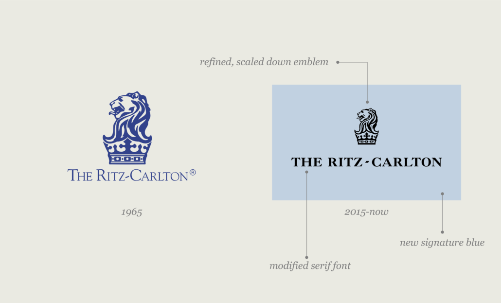
The Ritz-Carlton has a rich history, originally founded by Caesar Ritz, the King of hoteliers and hotelier of kings. The first US Hotel was founded in 1911, but The Ritz-Carlton Hotel Company, LLC was not formed until 1983. Through many acquisitions, the Ritz has still maintained its original purpose of creating a luxurious, elevated hotel experience. The logo reinforces the brands historic relevance by showcasing the British Royal Seal and a lion, which represents a financial backer.Changes were made to the branding in 2015 that may not have been recognized by the average consumer, but the brand cited that with the change in the hotel industry, they needed to keep up with the modern luxury consumer that prioritizes unique experiences when choosing their destination. They created new brand standards with the overall goal of achieving consistency in experience while also allowing every location to have a unique sense of identity. Visual changes were made to modernize the type, the balance of their logo and they changed their signature blue, amongst other changes. Over-all, The Ritz recognized where they needed to pivot and it paid off, allowing them to remain a staple in the luxury hotel market.


Starbucks

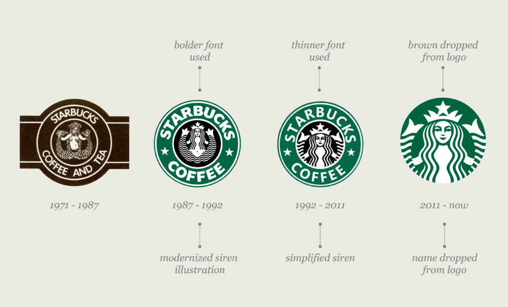
Undoubtedly one of the most recognizable brands in the Coffee industry is Starbucks. Founded a little over 50 years ago, they have come a long way from a Seattle roaster to a household name. Starbucks has remained popular through many culture shifts. They have seen a major evolution in their branding; once an ornate emblem of a siren paired with their name, they have now simplified to a modern icon of their famous siren and dropped the name from their logo, joining the likes of Apple and Nike.


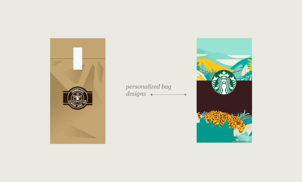
In the past decade, the coffee market has become saturated with copycats and also highly unique roasters. While Starbucks has remained true to their brand, they have also adapted. In the early years, their coffee was sold in brown paper packaging, but in the 90’s they started printing interesting designs on their bags implementing visual storytelling, helping them stick out amongst competitors.


Most famously, they popularized the famous holiday cups, a design choice that generated consumer excitement season after season with its Instagram worthy design.


Recognizing that the modern customer was looking for unique experiences when visiting coffee shops, Starbucks introduced their Reserve Roastery, highly unique locations that showcase innovation. Other design choices were made to appeal to those who were socially- and climate-conscious: Starbucks changed to a recycled material for their cups and have continued to focus on sustainable choices, reinforcing their presence at the top of the market.


Any brand that takes the time to understand their customer, their voice and the market they exist in, can avoid following fleeting trends and become an industry staple.


For more tips and tricks for navigating the current marketing and branding trends, join our mailing list to hear more! Need help updating, revamping or starting your brand? Contact us.

Pantone Color of the Year 2023

Pantone, the world-leading expert in color, recently announced Viva Magenta as their pick for 2023’s Color of the Year. Viva Magenta 18-1750 vibrates with vim and vigor with Pantone describing the color as, “a pulsating color whose exuberance promotes a joyous and optimistic celebration, writing a new narrative.” Read more

4 Benefits of Your Site Being ADA Compliant

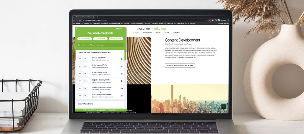
The Americans with Disabilities Act (ADA), developed in 1990, is meant to ensure that people with disabilities have the same opportunities as anyone else. Any business that serves the public must make sure their building accommodates people with disabilities of various kinds. Unfortunately, many businesses are not aware that ADA compliance also applies to digital store-fronts as well. Websites need to be accessible to people who have disabilities that affect their hearing, vision or physical capacities. Recently, a ruling was passed declaring the official standard of website accessibility for businesses. Read more

4 Small Towns That Give Off Perfect Fall Vibes


There is something about that small-town New England charm that beckons us – practically every seasonal Hallmark movie has a similar setting. We want to be surrounded by those autumn colors, front porches decorated with pumpkins, mums and hay bales, and white picket fences adorned with garland as we sip on our hot coffee (or pumpkin spice latte) to keep warm while wearing fingerless hand-knit gloves. Here’s four locations where you can find these idyllic settings and activities which will make you feel as if you were on the set of Gilmore Girls: a fun, Fall television favorite. Read more

Building a Brand’s Reputation through Design


Building a reputable brand is important to instill trust in the consumer so they feel confident in their decision to use a product or service being offered. Quality, company values, customer support and public relations are all key players in achieving trust, but design plays a large role in a brand’s first impression.


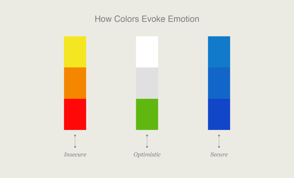
People have an innate ability to understand design principles and it impacts the decisions they make. Elements in a design like shape and color tap into the subconscious emotions of the consumer and are incredibly important when making branding decisions. For example, green evokes a feeling of optimism, blue a feeling a security, while red can be a stress-inducer. It is important to understand the target market for a brand and make the appropriate design choices to appeal to them.


Examples of a brand utilizing a few key principles of design

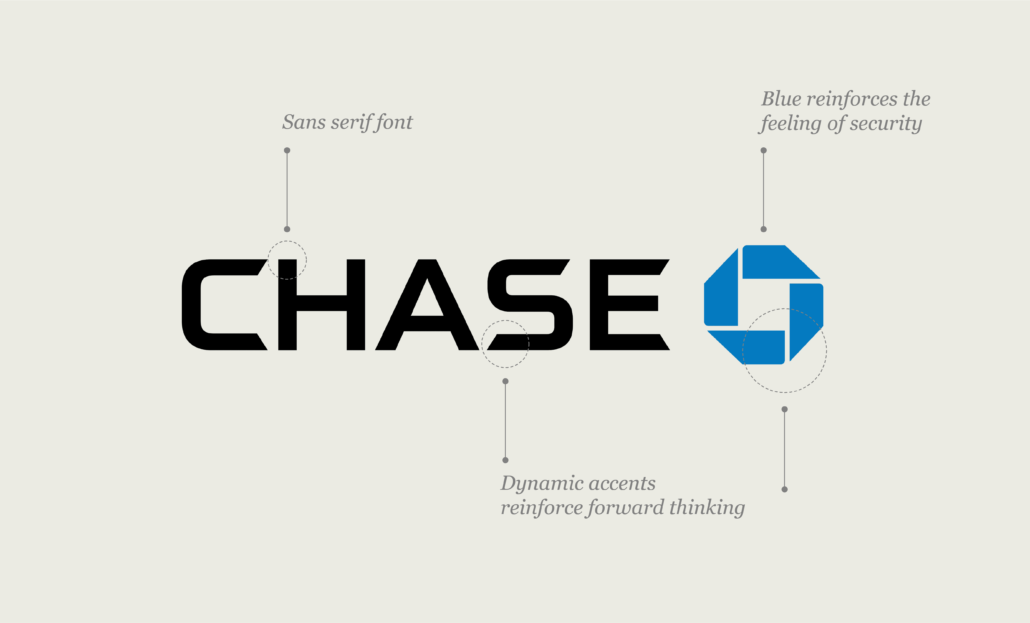
Banks are brands that need to communicate trust, longevity and legitimacy. Chase is one of the most trusted banks in America and we can see the choices they have made to reinforce this visually. They chose blue for their primary color, which gives the customer a feeling a of security – very important in banking. Now let’s talk about longevity, something you hope for in a bank: their logo is a custom, bold sans serif font. This communicates that they are timeless. They have used a sans serif font for over 60 years, which tells us they aren’t a fading trend, but they are established and long-standing. What else can we feel when looking at their logo? The font and Chase symbol have a dynamic design that implies movement and activity, which translates to growth and forward thinking; two things that are very important in the longstanding of any company.


Brands build trust through a streamlined web-presence

Another huge factor in a consumer forming opinions of a brand is their website. Fun fact: it only takes 50 milliseconds for a consumer to form their opinion about a website. This is important information to have when you are trying to stand out in a highly saturated market. How can we make sure to have branding that subconsciously makes someone want to stay on your site and trust it? Make a great first impression with color, spacing, symmetry, amount of text and font choices. This is partially relying on aesthetics, but many of those design choices are also about making information easy to digest and not overwhelming.


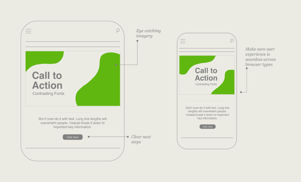
Here are a few practical take-aways to optimize a website to feel trust-worthy and easy to absorb:


  • Pictures speak a thousand words. Make sure to select a series of well thought out images that accurately represent your brand and what you’re trying to promote or sell.
  • Don’t over-do it with text. Long line lengths will overwhelm people. Instead, break it down to important key information.
  • Make sure all of your text and imagery is ADA compliant. This means ensuring there is enough contrast between your font and background colors throughout your site, as well as setting up the appropriate settings on your images (alt text, appropriate file naming, etc.). This will not only make the user experience easy, but it will show that your site is trustworthy and accessible for anyone that visits it.
  • Use high contrasting colors, different sizes and a complementary font in your text to call out important information. This will draw the user’s attention to focus on your key points.
  • One more tip to convey trust is consistency in branding and user experience across platforms and devices. Make sure you are creating that same effortless experience by making sure your site is mobile responsive and works seamlessly across browser types.


To start utilizing these concepts for your brand, you will want to start by understanding your customer, their needs and then speak to them through these strategic design principles.


For more tips and tricks for navigating the current marketing and branding trends, join our mailing list to hear more! Need help updating, revamping or starting your brand? Contact us.